Today is going to be a great day on Once Wed! I am so excited the lovely Chelsea of Oh My Deer is here to share with us her interpretation of a wedding table on a budget. I’ve been so fortunate to form a friendship with both Tec and Chelsea over the last year, and when Chelsea agreed to put together a table for the site I was thrilled. If you are a bride looking for a hairpiece for your own wedding or for your bridesmaids, definitely check out her adorable etsy shop, Oh My Deer. Thanks again you two!
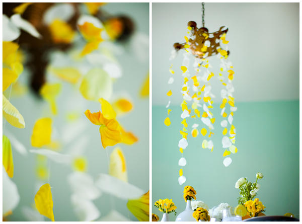
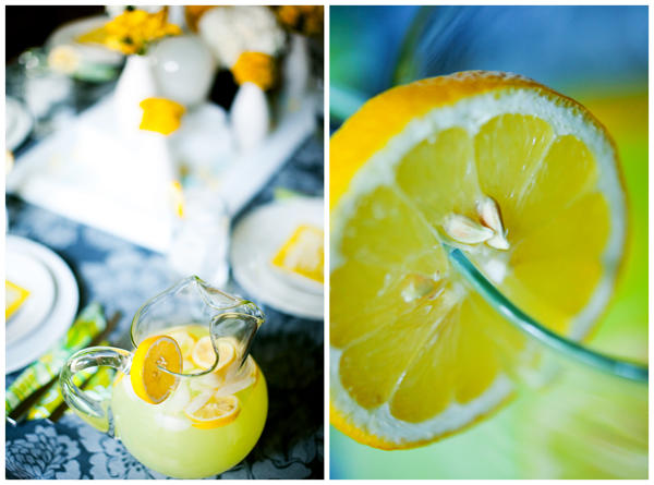
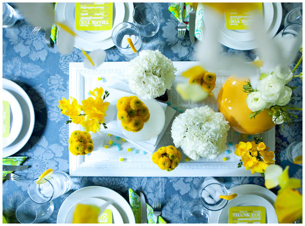
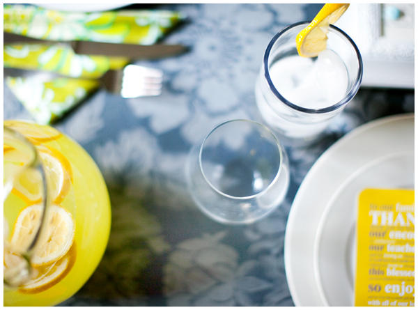
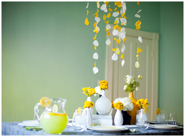
I decided on a mainly yellow and gray color scheme after I a) scored a killer deal on the gray table cloth from Anthropologie and b) worked with several brides lately who have been using the same two colors. I added pops of teal and green in every so often to keeps things on the light side, but you could add darker colors like cranberry or orange if your taste leans more that way. I also wanted to create an environment that would be season-less. Click “more” below to see the rest…
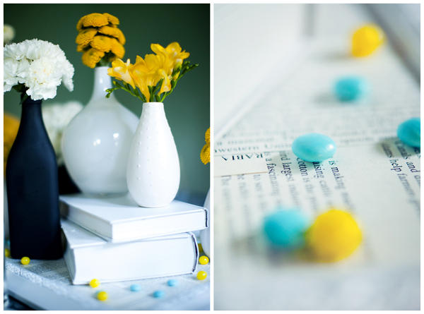
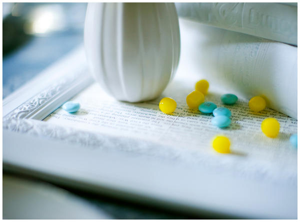
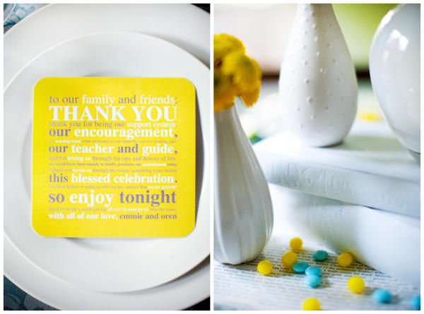
We also spray painted the books (which I’d glued shut weeks before) and the centerpiece white. The centerpiece where the books and vases are placed is actually a framed picture that I purchased from a discount store. Miriam primed the frame and glass and then gave it a thin coat of white spray paint. I then cut pages out of an old encyclopedia and glued them on the primed glass.
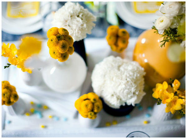
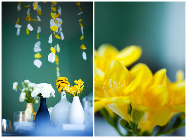
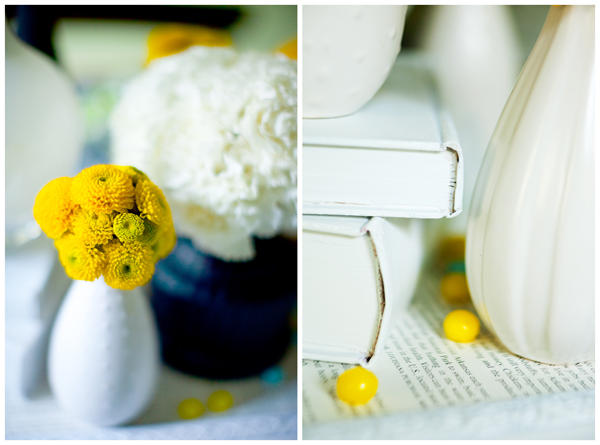
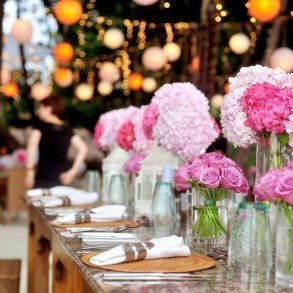
As for the flowers, I purchased them at a local wholesale florist (Import Flowers) with my yellow color scheme in mind. I also bought some white flowers to keep things light and airy. What’s on the table is $40 worth of flowers. (The ranunculus’ were by far the most expensive, but I’ve got such a weakness for them, and I just KNEW they’d look perfect in that yellow vase.)
Again, I wanted to keep the feel of the table geometric, so I chose flowers that were rounded (except for the freesia, which I used because it smells fantastic and the florist gave it to me for free because it was getting old) and that look nice when they’re bunched together. Keeping the flowers grouped together, as opposed to mingling them, helped to keep this feel. Plus, plopping a bunch of flowers that are all the same in a vase couldn’t be easier! I mean, that’s basically fool proof.
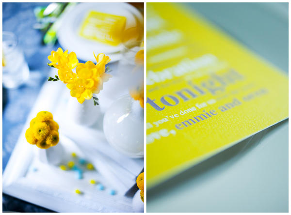
I also created a “thank you” card that was placed at each seat. I’ve never been a fan of assigned seating at weddings, but I love the look of having something at a seat. I had them printed at a local printing shop (though you could just as easily use Kinkos) and then rounded the corners with a corner paper-punch.
Though I’m a sucker for a wedding that is themed specific for the season it’s in, I also love one that can translate well into fall or spring, summer or winter. The table scape is also fairly geometric and two-toned, with hints of more fluid shapes and pops of color (the floral pattern of the table cloth, the pops of green and red in the napkins). To me, this lent the table to be both modern and warm.
* * * * * *
A big “thanks” goes out to the handsome photographer who took these pictures, Tec Petaja. The table scape looked pretty in our dining room, but he made it look classy through his lens. Thanks a million, Huz.
