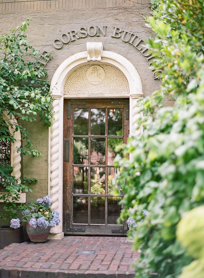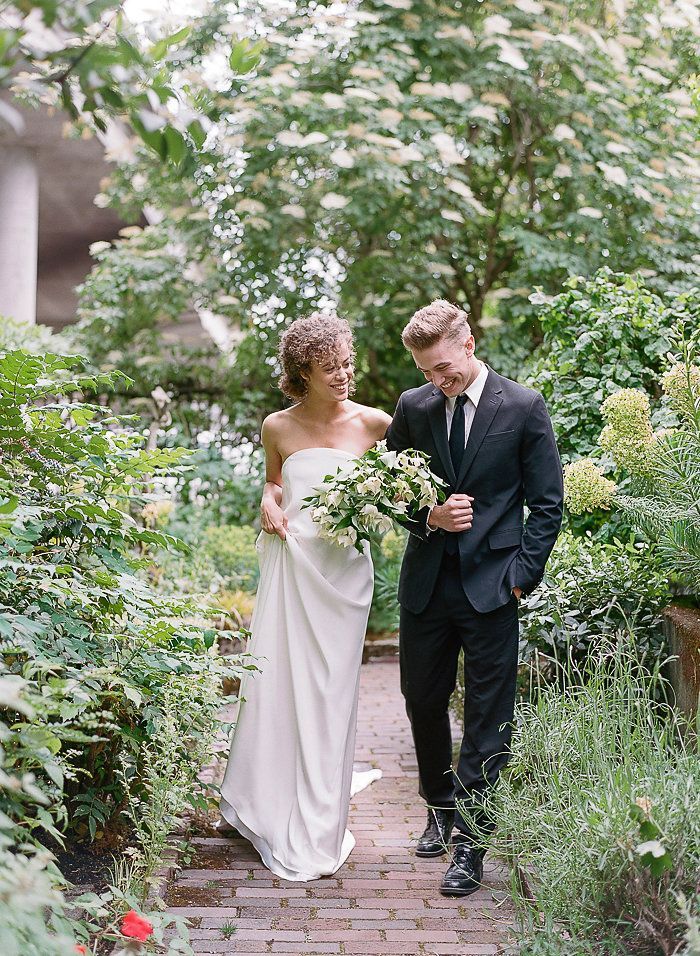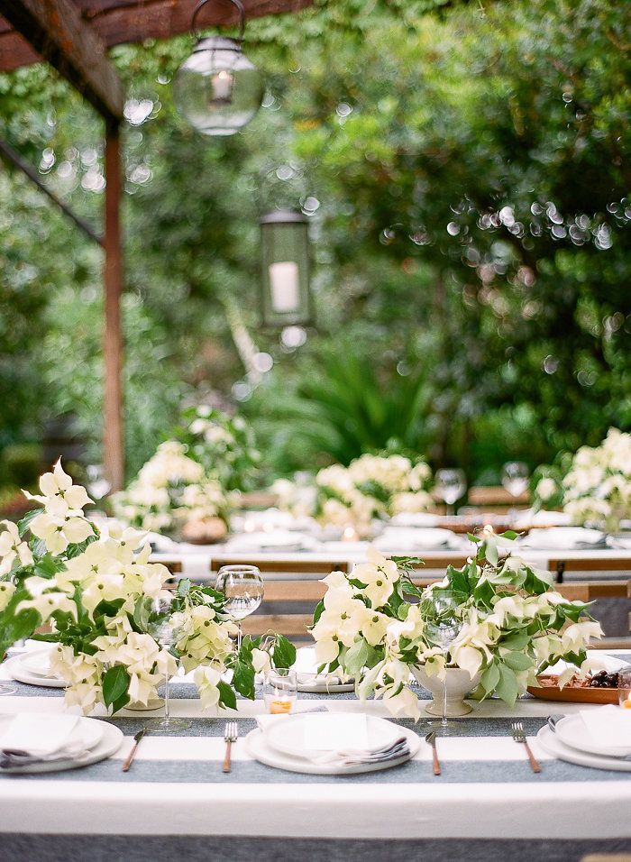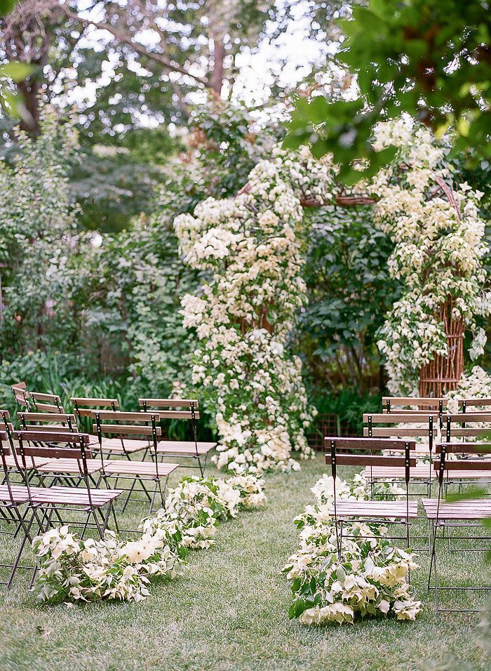
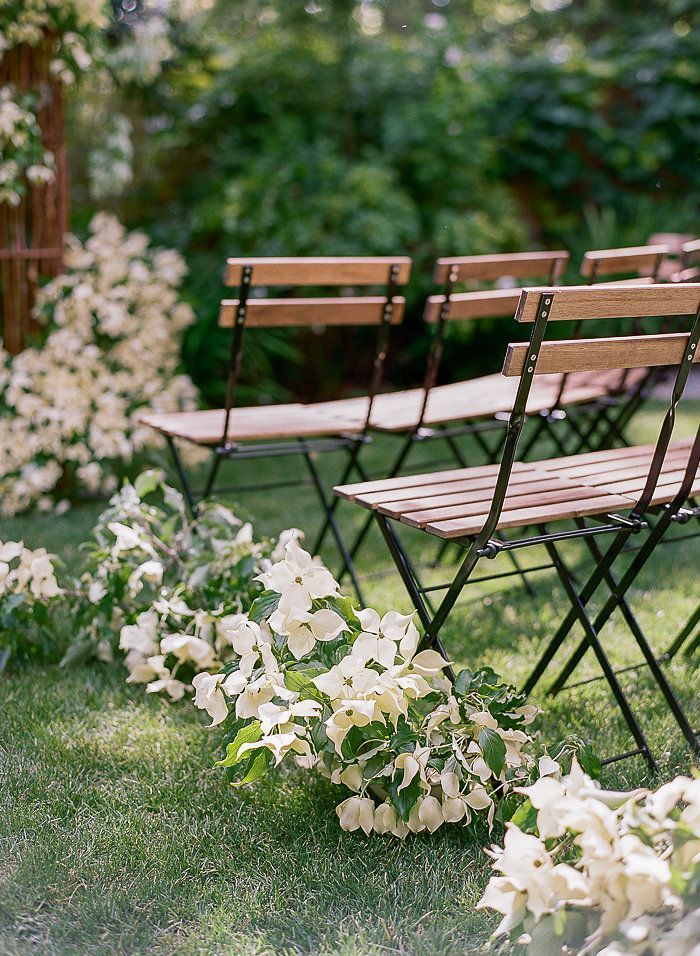

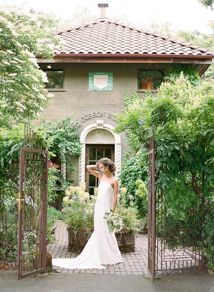
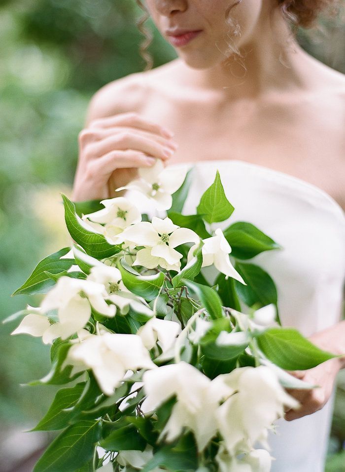
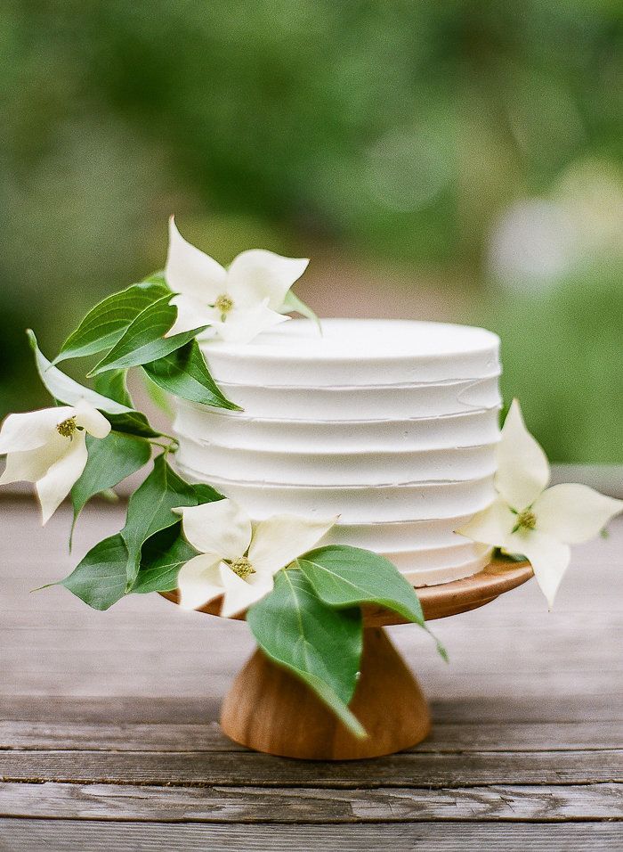
Callista and Amy worked together to conceptualize this editorial design. Inspired by the intersection of sleek, minimal design and the old world charm of The Corson Building, they set out to design a fresh look in a well loved space. Their goal was for the design to feel effortlessly romantic, but also attainable for real couples. For the floral design, Amy worked entirely with dogwoods to create a design that was simple and clean but still lush and natural. The arch was designed to look like the dogwood branches had grown up and onto it. It was surrounded by a half-circle of bistro chairs and an aisle lined with dogwood arrangements to set the scene for the ceremony. Dogwoods also elegantly adorned the berry and buttercream cake.
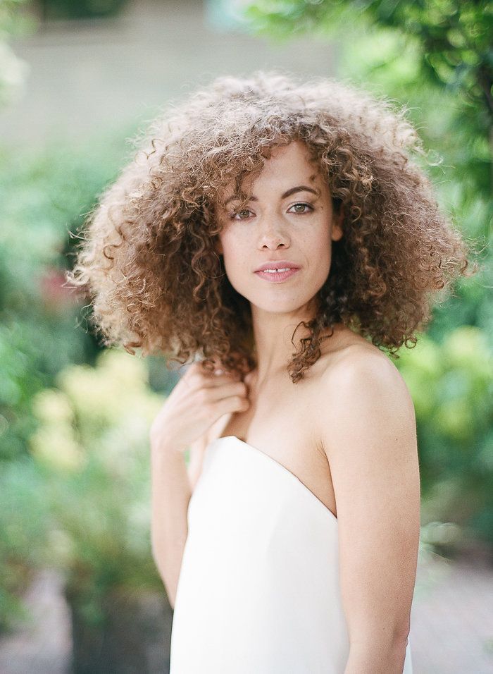
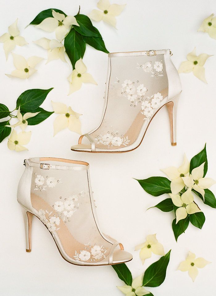
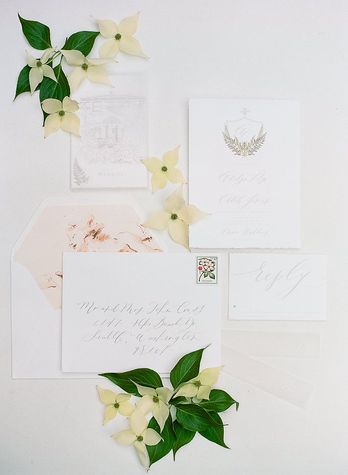
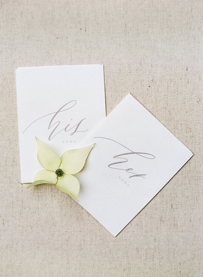
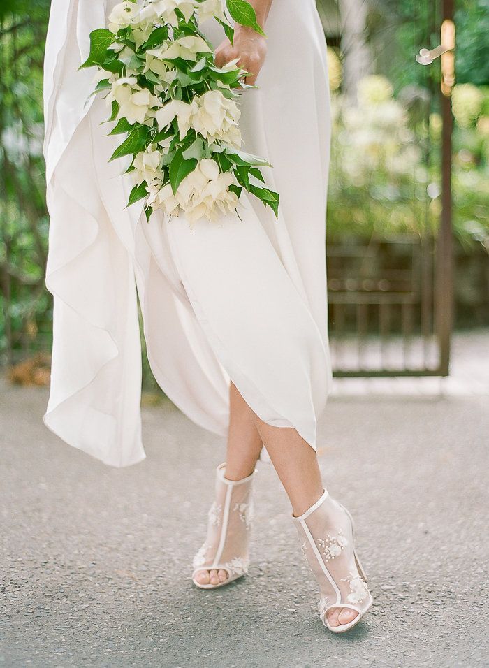
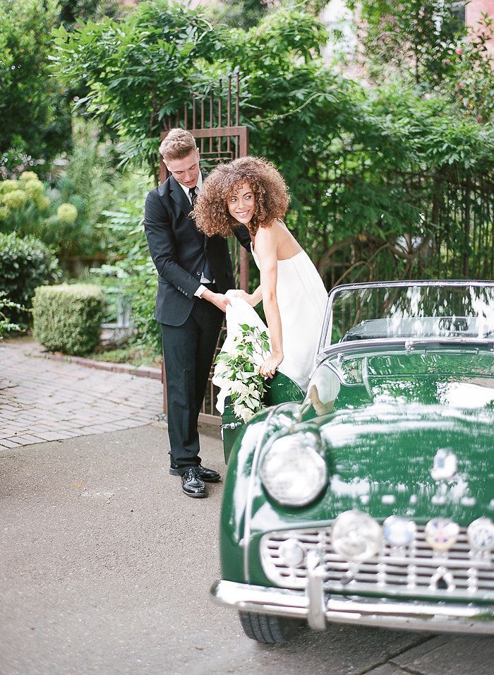
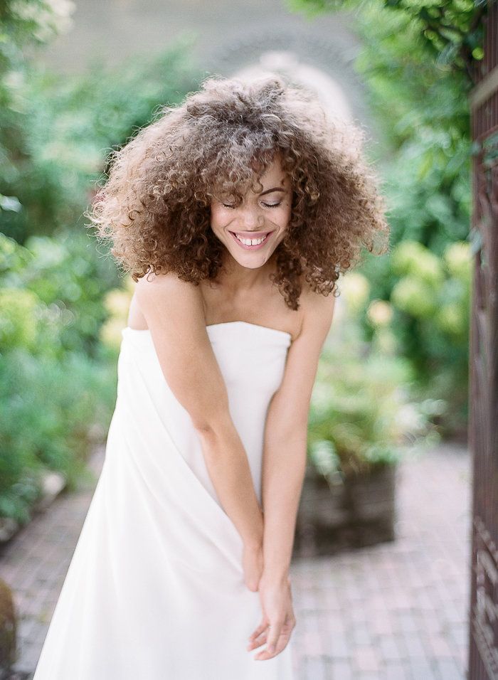
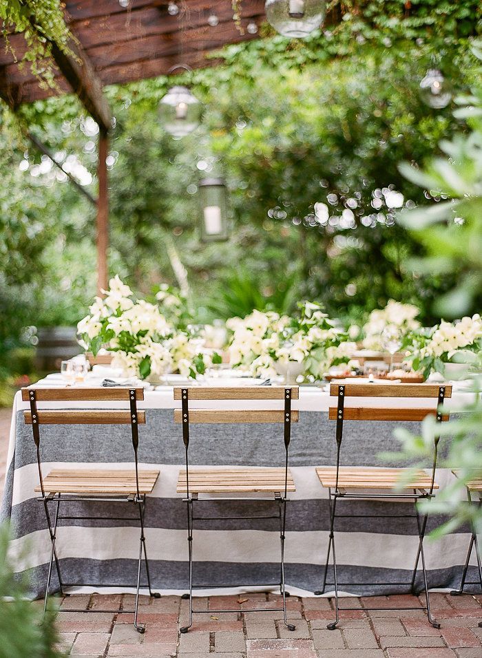
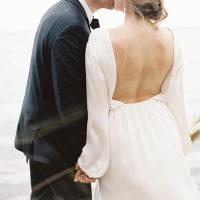
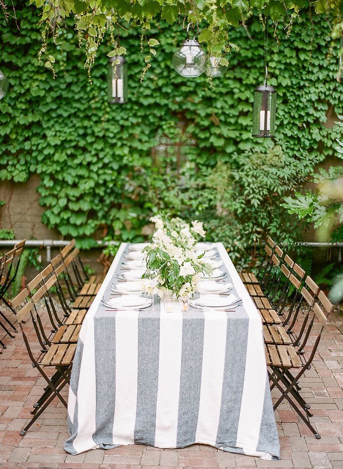
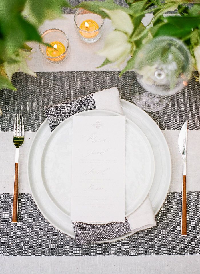
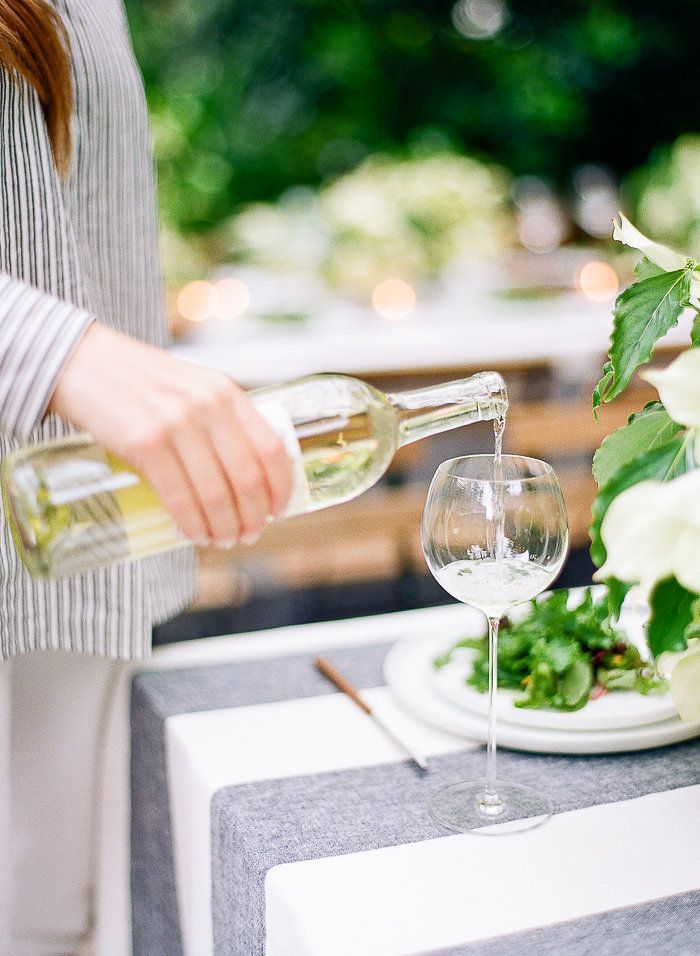
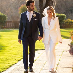
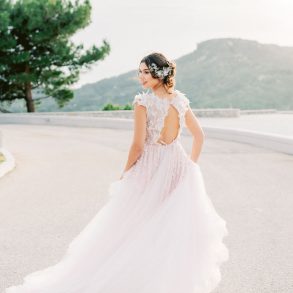
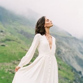
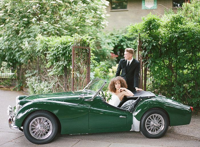
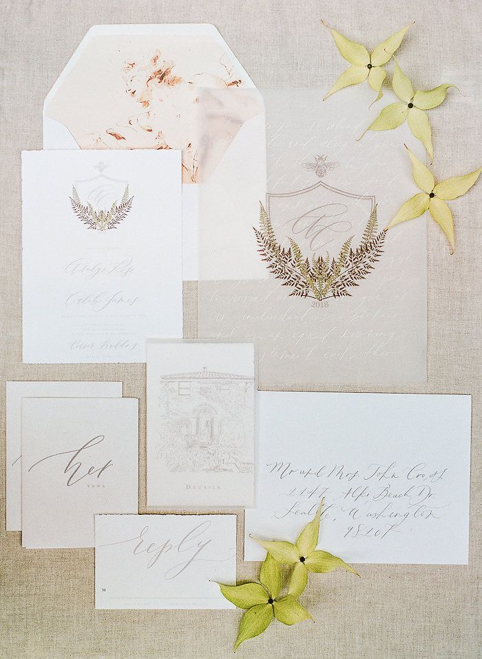
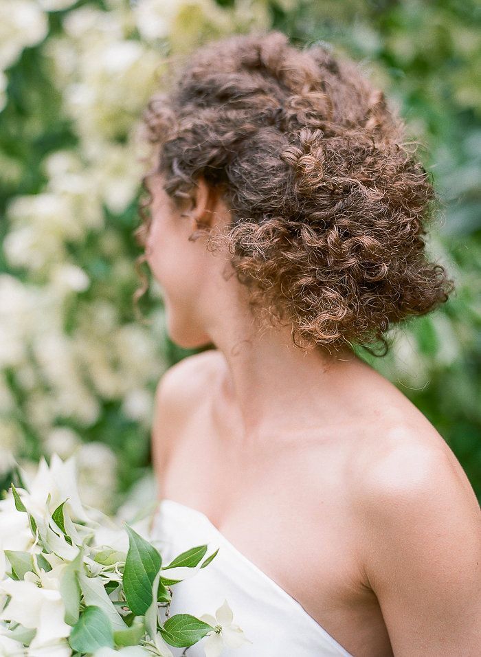
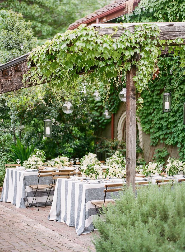
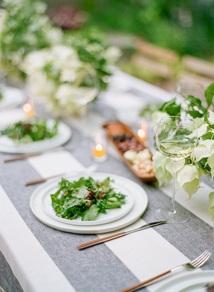
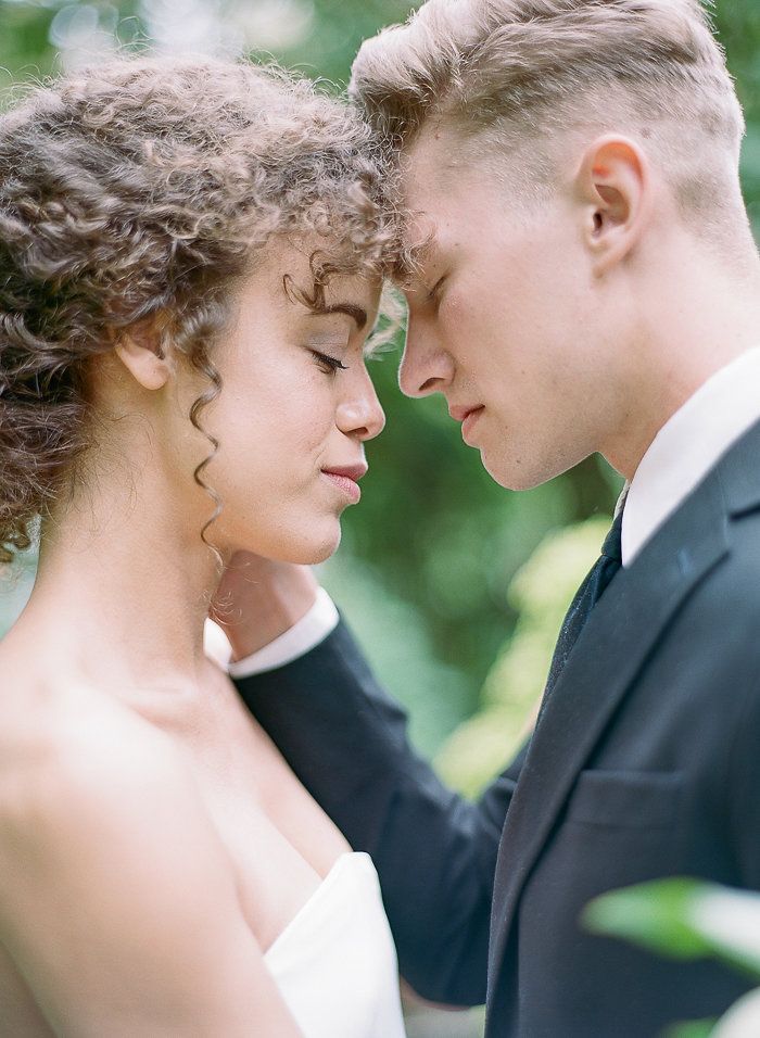
The reception was set under a grapevine covered terrace, and featured white ceramic plates, contemporary wine glasses, wood handled flatware, and a dusty navy and white stripped linen. Hanging lanterns added a festive glow to the space. The menus brought together romantic calligraphy with modern typeface. This old and new combination was echoed in the rest of the paper goods, as seen in the intricate drawings of venue, the couple’s family crest, and handmade vow books. The bride’s attire featured the deceivingly simple gown. What at first seems like a clean sheath reveals a fluttery cape that catches light and movement in the most feminine way. We styled both an elegant reception look with a soft updo and natural makeup, and a fun reception look by letting the bride’s hair down. The bride wore sheer booties embroidered with tulle and pearls. The engagement ring featured an elegant Asscher cut diamond. The couple escaped into the evening in a vintage convertible.

