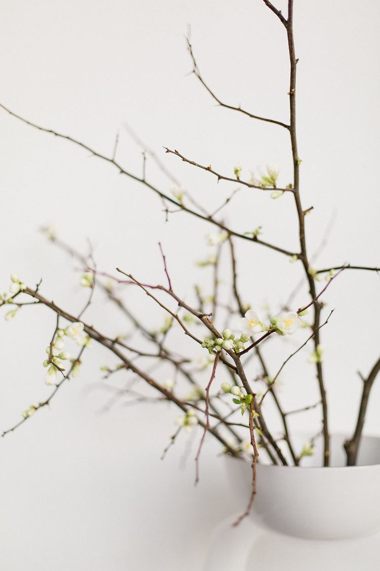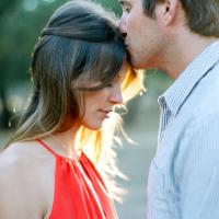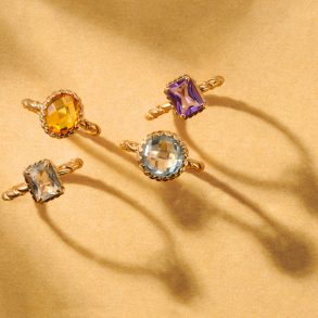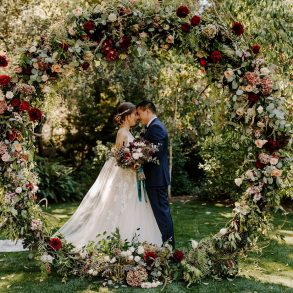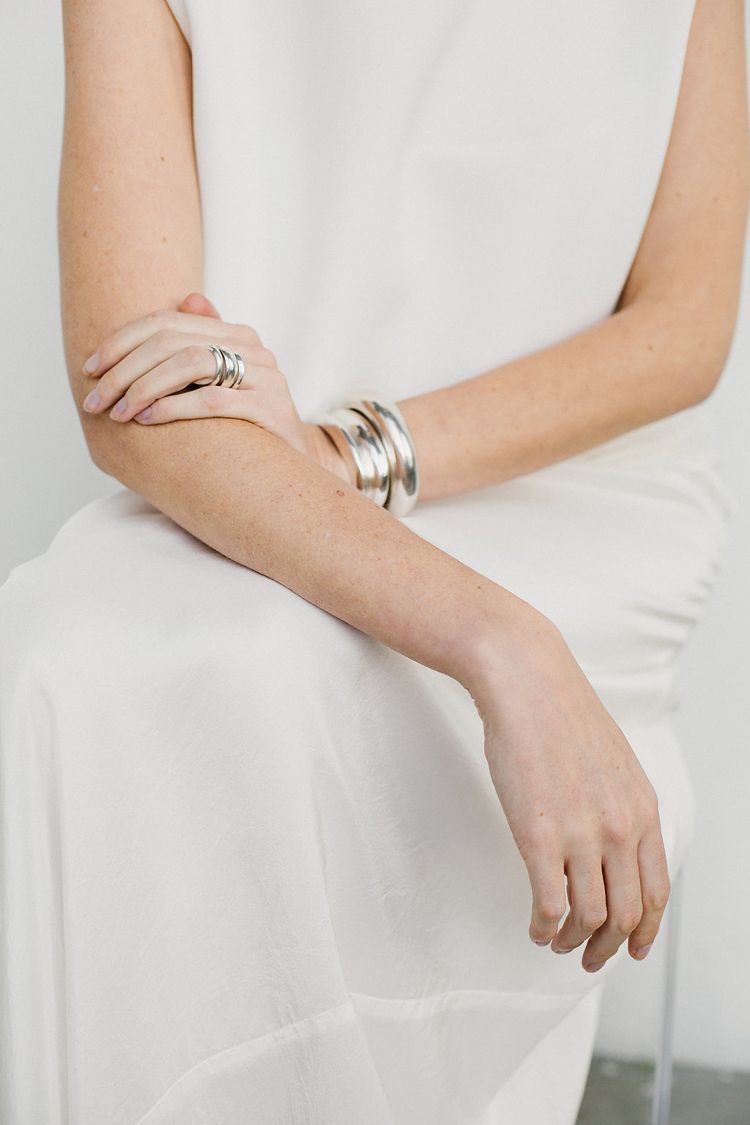
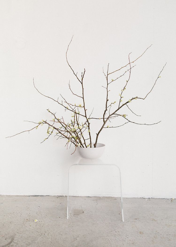
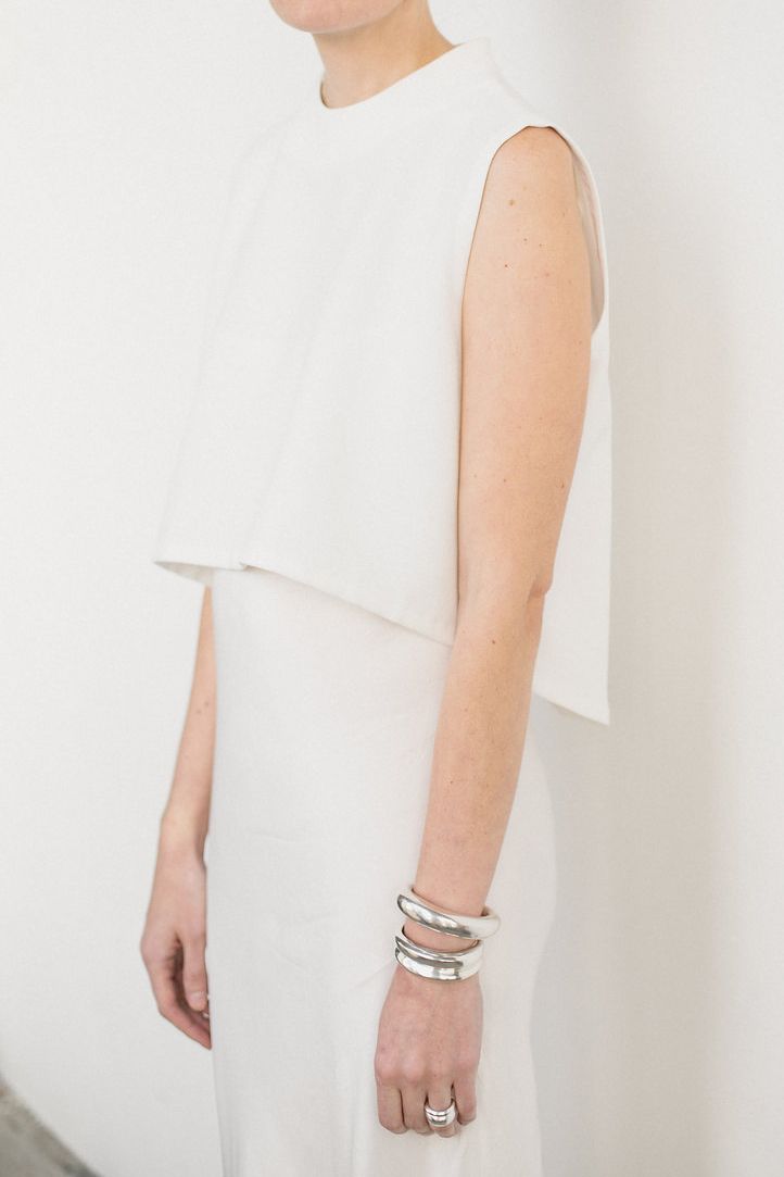
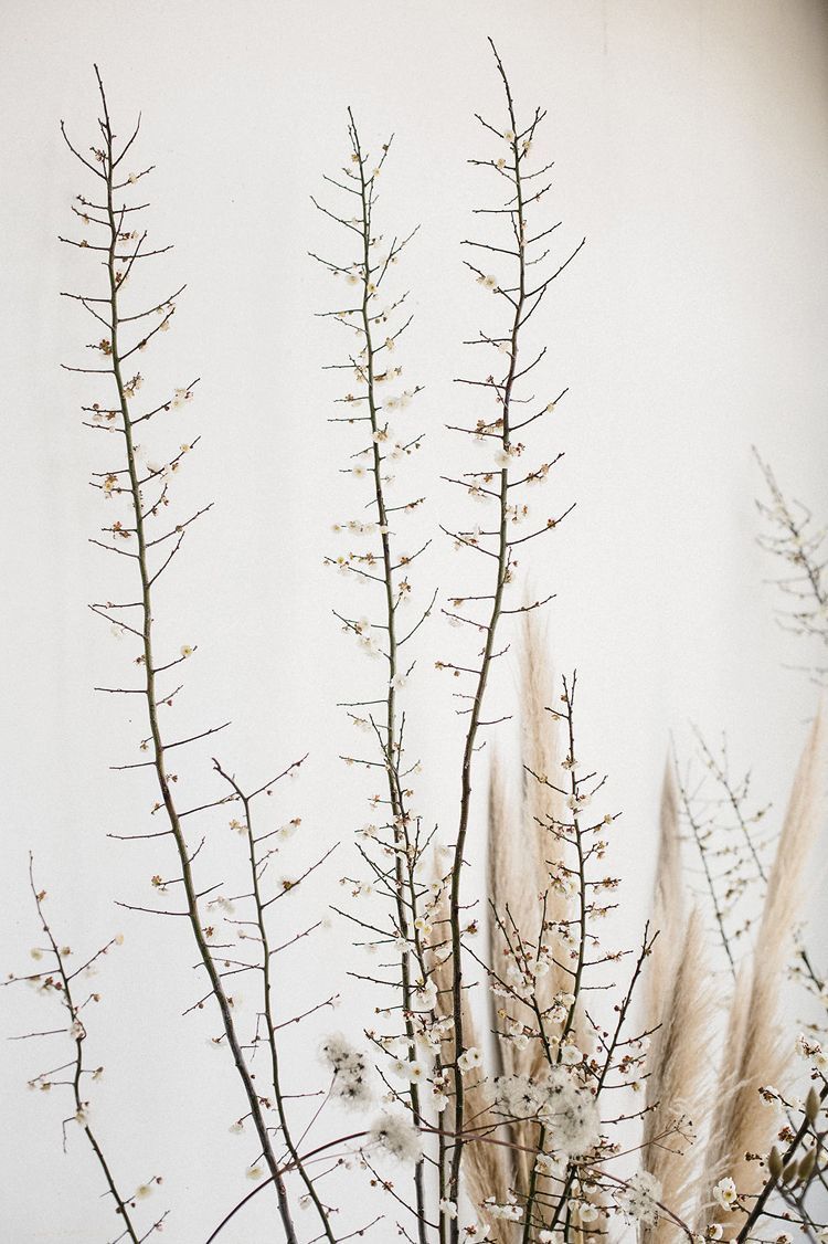
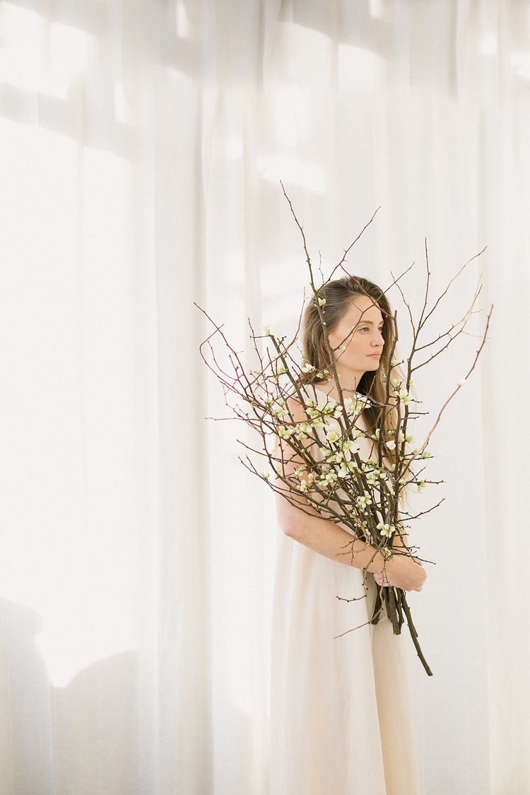
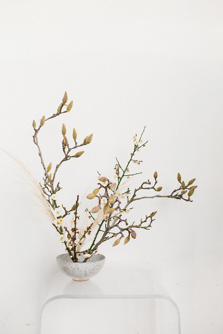
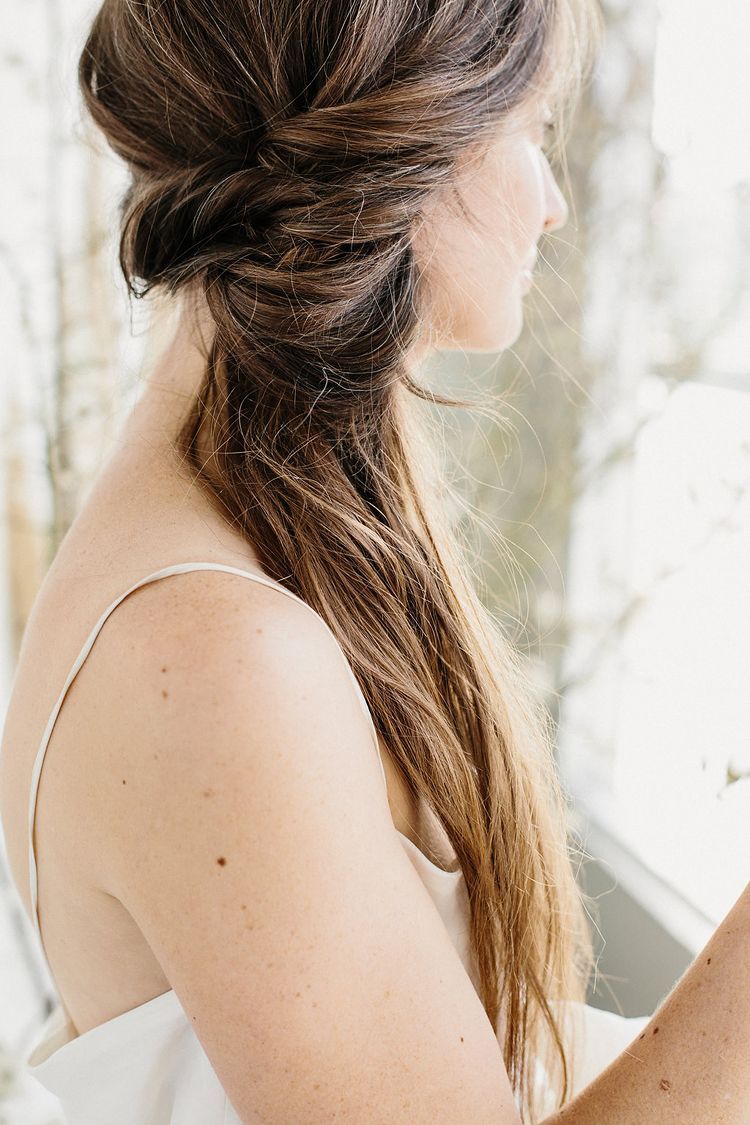
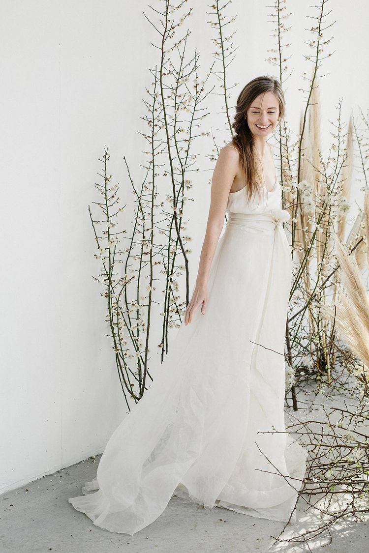
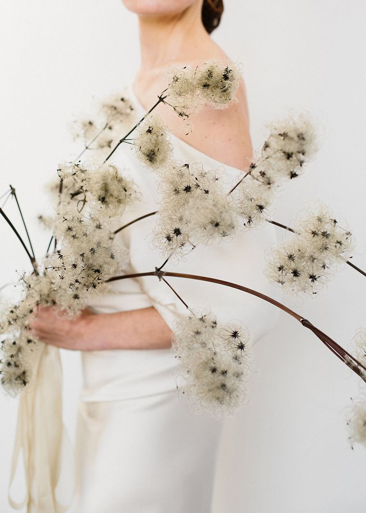
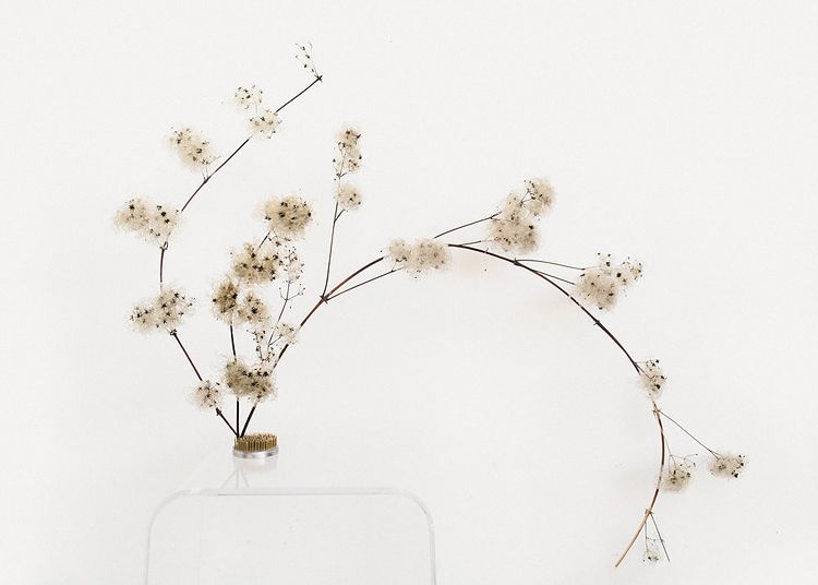
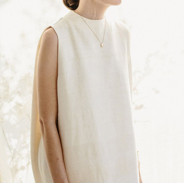
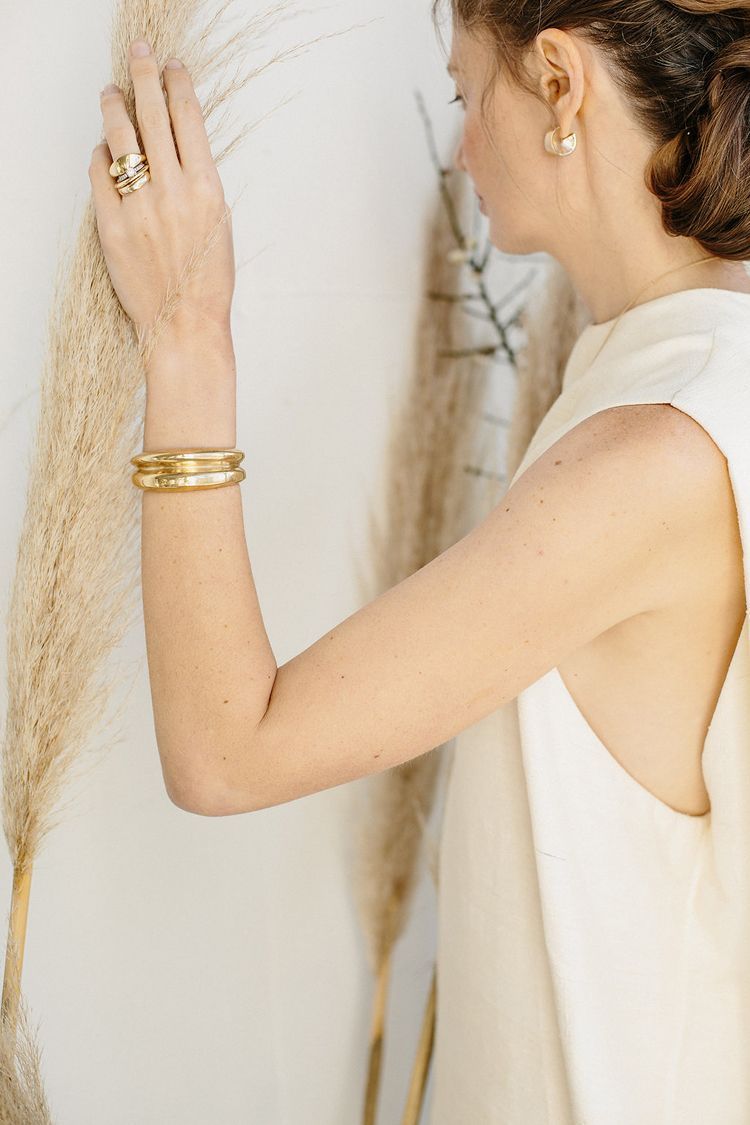
Rustic doesn’t mean burlap. Natural doesn’t mean tree trunks sliced into wedges and thrown on a table. Baby’s breath isn’t the end-all-and-be-all, and your wedding reception doesn’t have to be decorated end-to-end with kitschy knick knacks. A rustic aesthetic CAN also be minimal and modern, and here, Studio Mondine shows us how with gorgeous natural elements: budding branches all in neutral tones with unique textures (those fuzzy pods are magnolia buds – aren’t they incredible!), mixed with tall pampas grass fronds. Simple shift gowns with minimal detailing, and bold, restrained jewelry. It all adds up to something way better (and more unique) than that burlap and mason jars combo you’ve been seeing on Pinterest.
Read more from Studio Mondine:
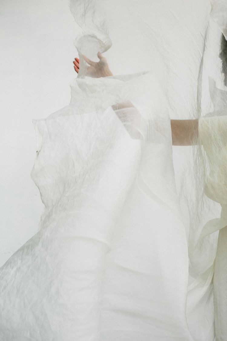
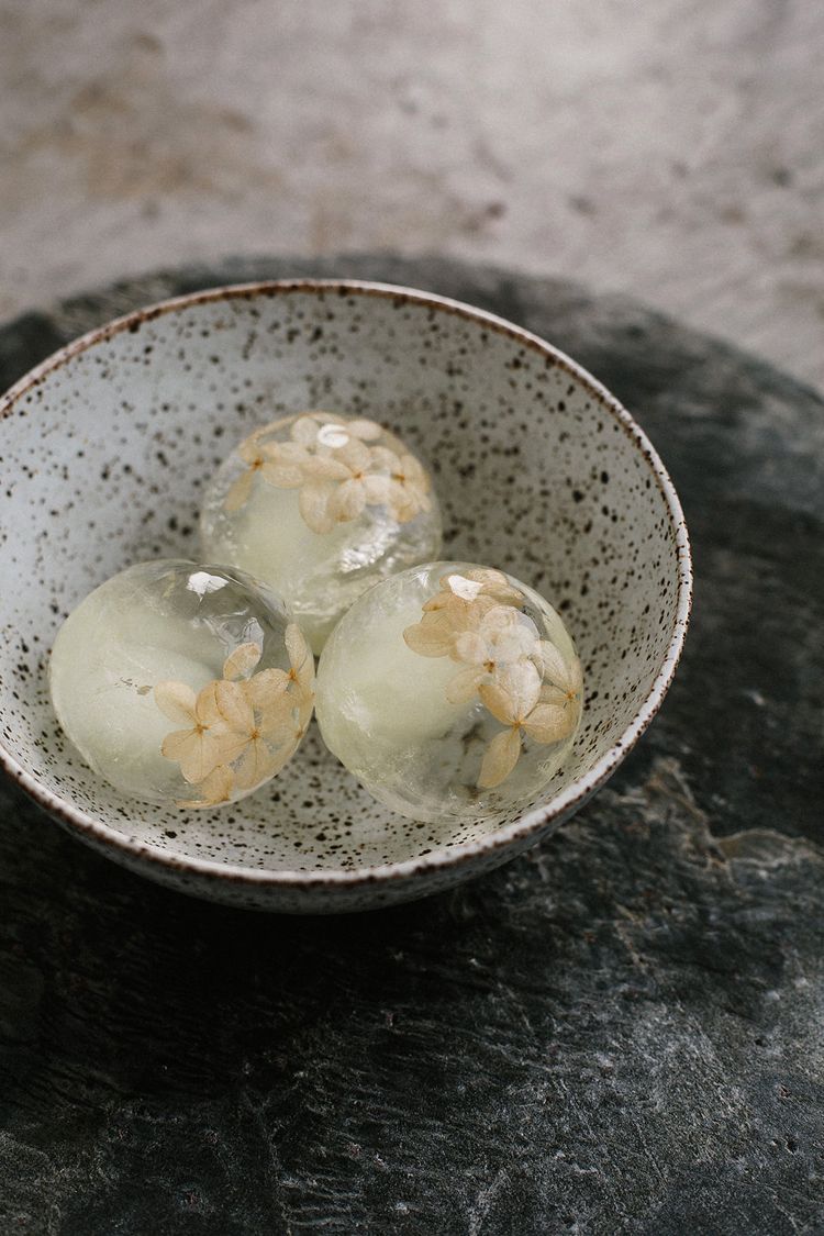
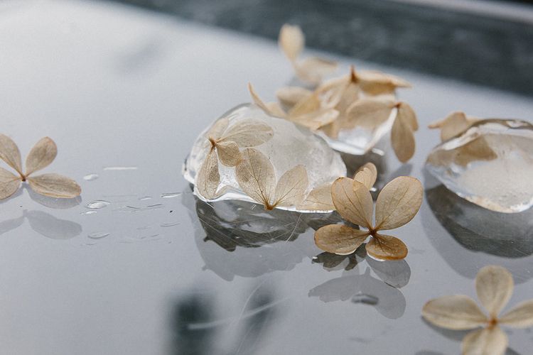
While creating this editorial project we were inspired by the concept of translucency. Interested in exploring how light passes through various materials like flowers, water, and textiles, we observed the depth of natural, beautifully detailed textures that were uncovered through light exposure or by layering different elements.
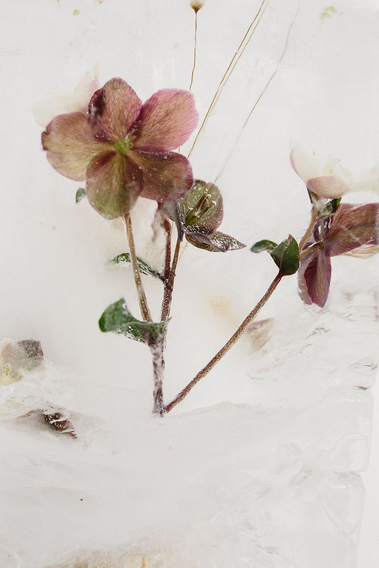
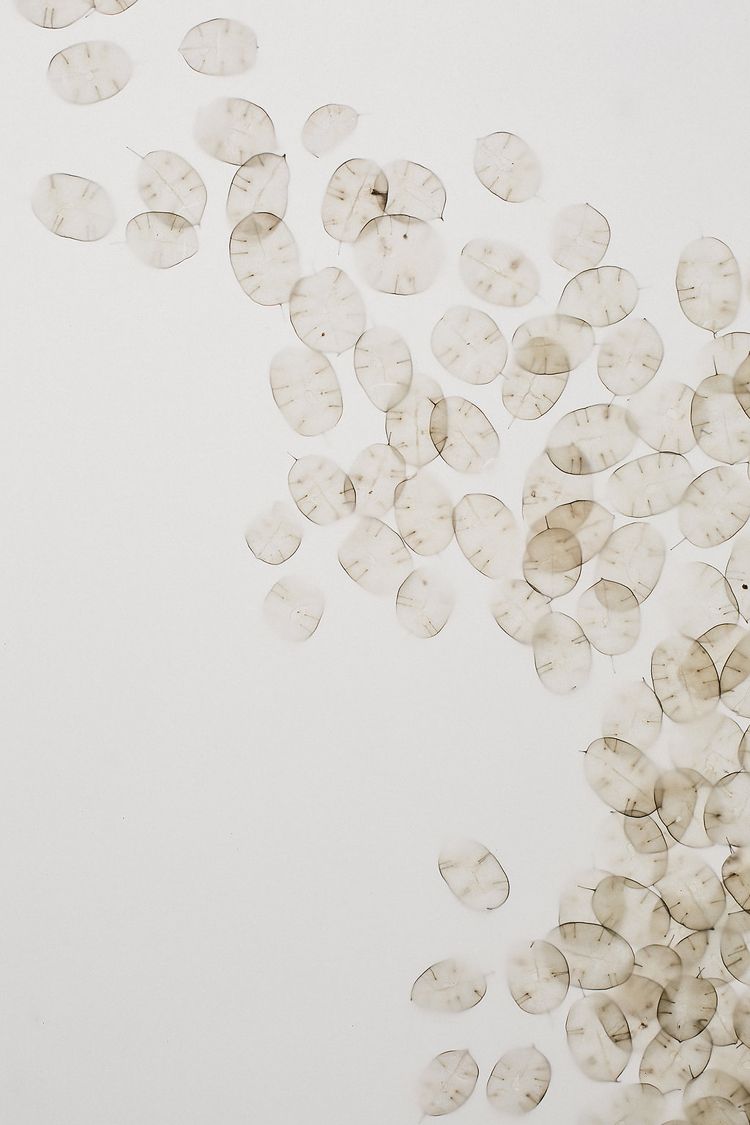
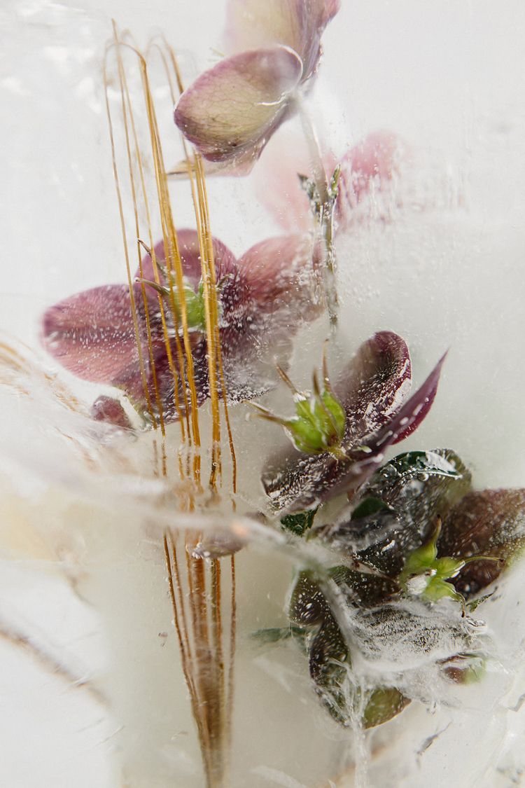
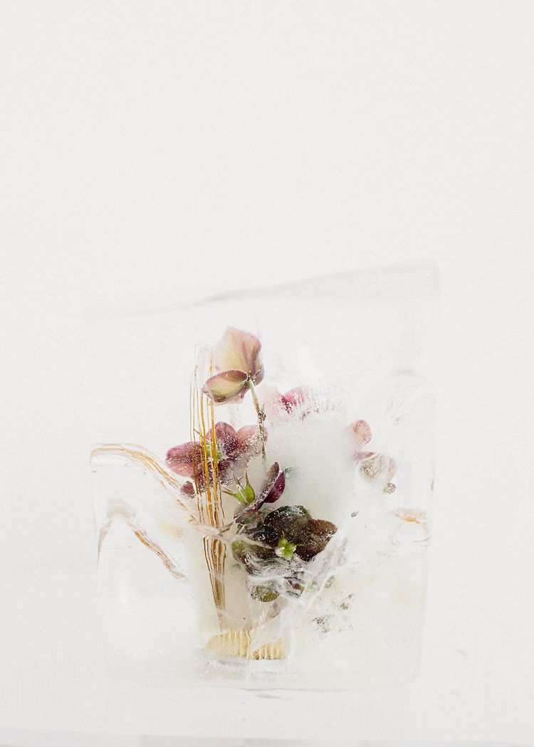
To highlight a wintery undertone, we chose dried flowers like lunaria and pampas grass as well as blooms available mostly in California during Winter – blooming branches, helleborus – and created a frosty environment along with other details.
Meghan K. Sadler captured interesting angles of our ikebana arrangements frozen in ice and the depth created by the layers of suspended blooms.
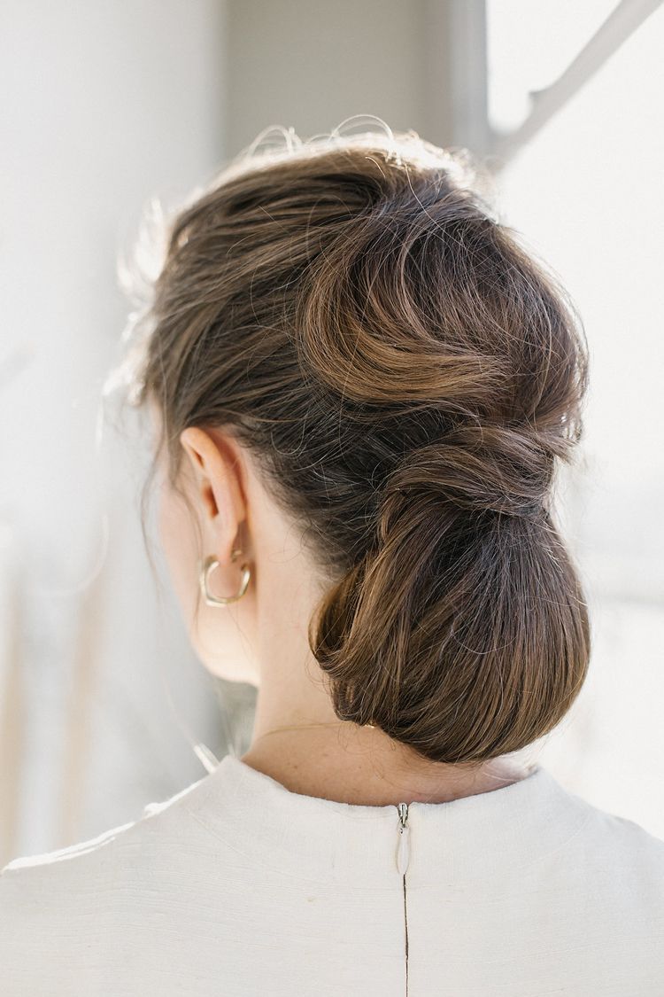
For our attire and jewellery we focused on clean lines and soft textiles to play into the idea of translucency and allow light to bounce through the fabric. To compliment our minimal and wintery look Katie Nash created very naturalistic, almost frosty looking make up and hair that highlighted model’s beautiful features.

