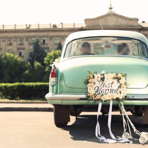
Want to know the hottest colors for 2016? Take a peek at the Pantone Spring Color Report.
These 10 happy hues selected for 2016 work well alone or in combination. Mix up texture, shapes and colors for the wedding palette that is perfectly you.
We can’t get enough of these pretty shades and how completely gorgeous they can be for your Big Day.
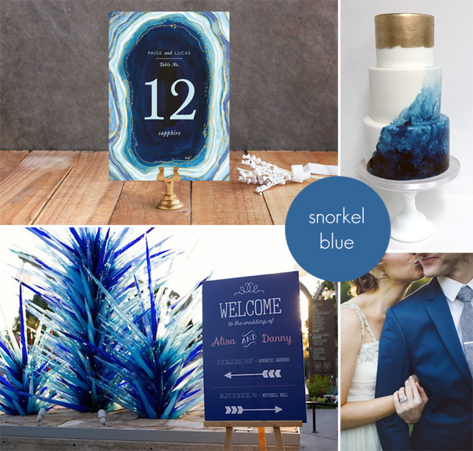
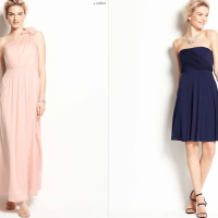
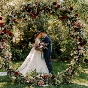
Snorkel Blue — Pantone 19-4049
Although you might mistake this deep blue for navy, it’s not quite that dark and is in fact a bit more vibrant than navy blue. This jewel-like tone is a beautiful base for any wedding palette, especially if you find black is too bold.
Complements Pantone colours: Buttercup, Iced Coffee and Peach Echo.
Photo credits clockwise from top left: Minted; Sweet and Saucy Shop; The Schultzes; Dustin Sheffield Photography
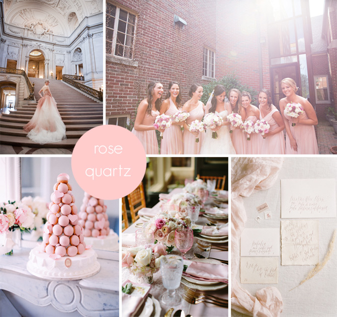
Rose Quartz — Pantone 13-1520
A warm pink, this color is sure to keep you calm on your wedding day. Drawn from gem tones, there is a natural glow to this shade, a perennial favorite with brides.
Pairs well with Peach Echo, Serenity and Lilac Gray.
Photo credits clockwise from top left: Deann B Photography; Jill Doty Photography; Tamara Gruner Photography featuring calligraphy by Layers of Loveliness; Penny Dinn Photography; Le Secret D’Audrey
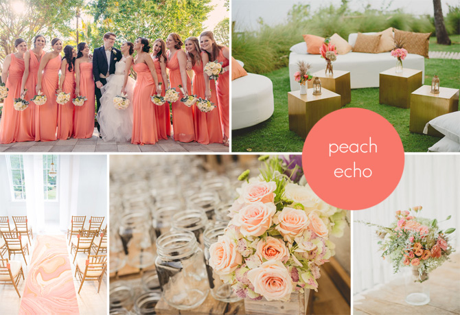
Peach Echo — Pantone 16-1548
Nearly a shade of coral, this shade from the orange family is vibrant and looks gorgeous at both indoor and outdoor weddings.
Co-ordinates with Rose Quartz, Serenity and Lilac Gray.
Photo credits clockwise from top left: Matt Steeves; next two by Terralogical; Chris Sosa Photography; Morgan Blake of Three Pennies
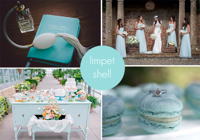 Limpet Shell — Pantone 13-4810
Aqua with a touch of Tiffany blue, this pastel shade has a marine-inspired feel that is great for both modern and vintage themed weddings.
Companion colours include Iced Coffee, Rose Quartz and Peach Echo.
Photo credits clockwise from top left: Zorz Studios; Neil Hanson; Connie M. Chung; Ashley Sawtelle Photo of vintage buffet from Yonder Floral & Decor House.
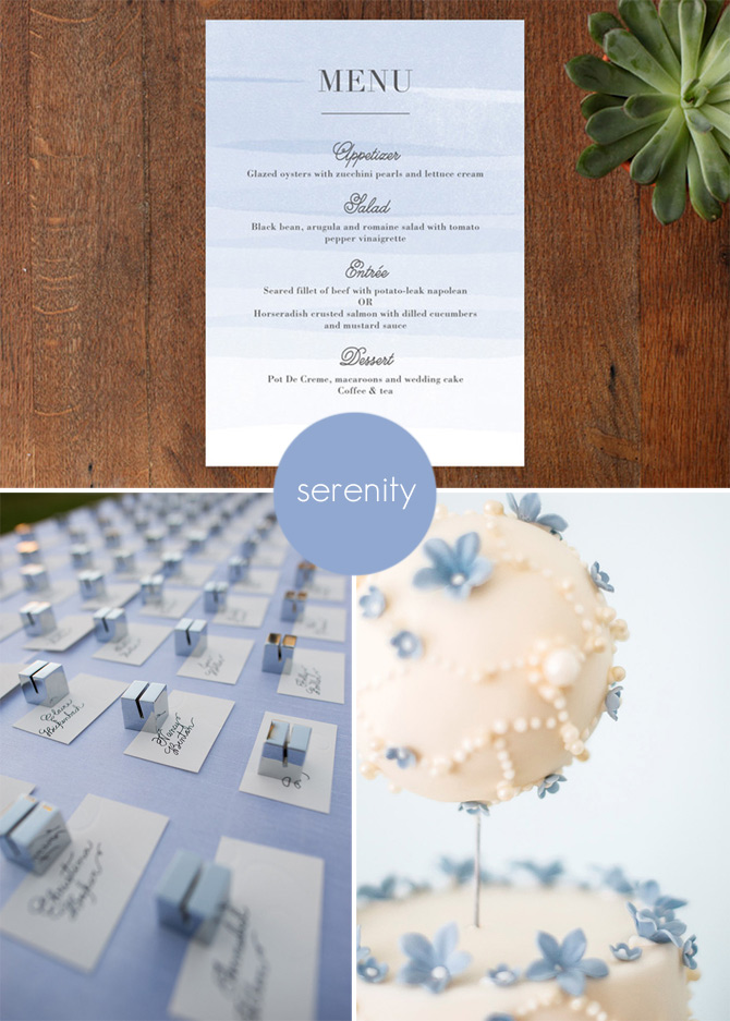
Serenity — Pantone 15-3919
This breezy blue brings a sense of airiness and calm to your wedding palette.
Accompanying colors Buttercup, Snorkel Blue or Peach Echo.
Photo credits clockwise from top left: Minted; Rosalind Miller Cakes; Chung Li Photo of calligraphy by The Pampered Paper.
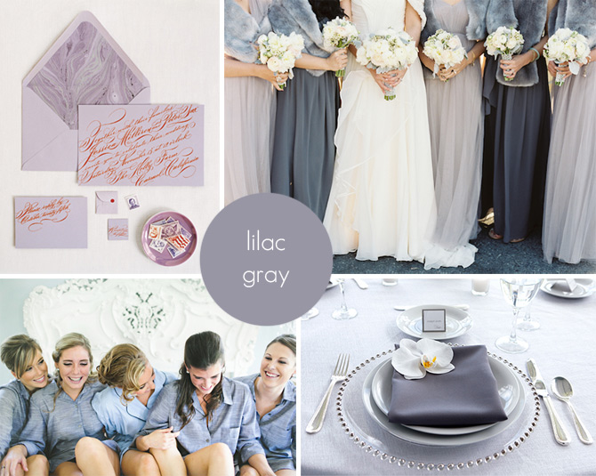
Lilac Gray — Pantone 16-3905
A silvery purple-gray that bring an alternative elegance to an all-gray palette.
Complementary colors include Green Flash, Fiesta and Iced Coffee.
Photo credits clockwise from top left: Ditte Isager for Martha Stewart Weddings; Jen Huang Photography; Heather DeCamp Photography; The Schultzes.
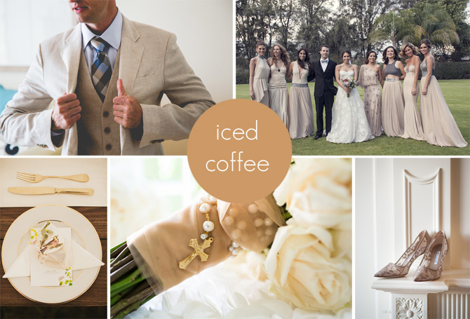
Iced Coffee — Pantone 15-1040
A creamy beige neutral that isn’t only for rustic wedding themes, this earthy shade will ground your wedding color choice.
Pairs well with Lilac Gray, Serenity and Rose Quartz.
Photo credits clockwise from top left: Laura Ford Photography; Sombrilla Photo by Ana Lorena Mendez; Ira Lippke Studios; Duke Photography; Daring Wanderer.
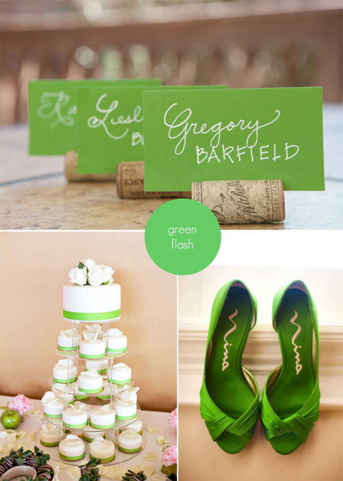
Green Flash — Pantone 15-0146
Vibrant, modern and fresh you might be surprised to see this used as a wedding color, but it has an enduring quality that is beautiful for spring and summer nuptials.
Goes well with Snorkel Blue, Serenity and Limpet Shell.
Photo credits clockwise from top left: The Pampered Paper; Brooke Images; Yvonne Wong.
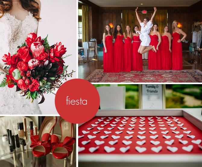
Fiesta — Pantone 17-1564
Vivid, vivacious and vibrant, this bold red would be easy to incorporate into dramatic evening weddings or glam winter weddings.
Colors that pair well include Green Flash, Limpet Shell and Snorkel Blue.
Photo credits clockwise from top left: Mackenzie Jean Photography, bouquet design by Natural Touch Florals; Robert and Kathleen; The Goodness; Karmel Studios.
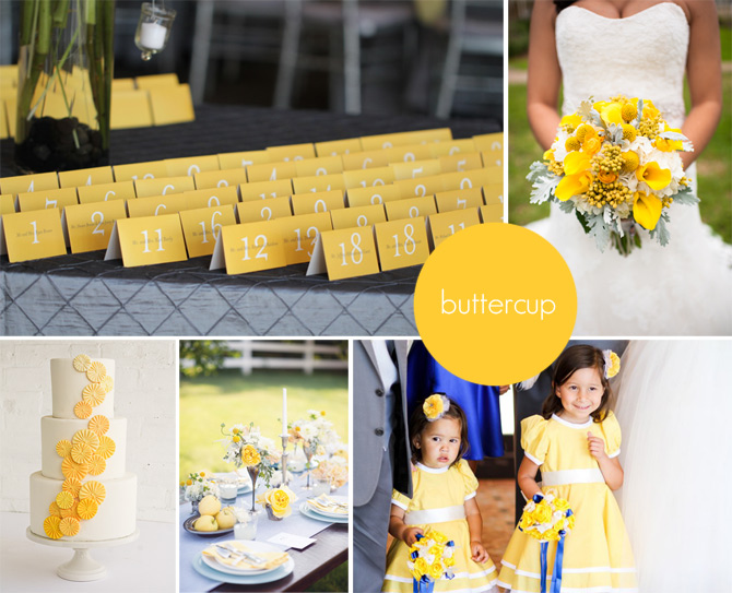
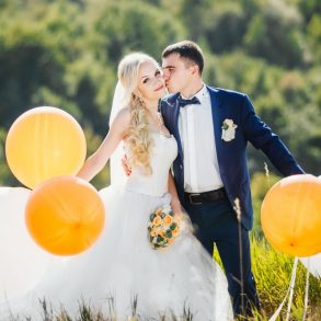
Buttercup — Pantone 12-0752
This glowing, sunny yellow plays well with many other colors and would be a delightful addition to spring, summer or fall weddings.
Colors that play well with Buttercup include Serenity, Snorkel Blue and Lilac Gray.
Photo credits clockwise from top left: Ilonka Floral Decorator; Laura Yang Photography; J. Anne Photography; Paper Antler; Erica O’Brien Cakes.
